Title here
Summary here
Import the stylesheet once in your entry point:
import "@wetron/react/styles.css";import { ModelGraphView } from "@wetron/react";
<ModelGraphView
graph={graph} // ModelGraph - required
onTargetClick={setSelected} // (target: PanelTarget) => void
colorMode="system" // "light" | "dark" | "system" (default: "system")
onWarnings={(w) => console.warn(w)} // called when graph has parse warnings
selectedEdgeTensorName={null} // highlights the matching edge
searchQuery="" // dims nodes that don't match the query
/>;Renders the full interactive graph. Nodes are coloured by operator category. Click a node or edge to receive a PanelTarget you can pass to NodePropertyPanel.
| Prop | Type | Description |
|---|---|---|
graph | ModelGraph | Required. The parsed model graph. |
onTargetClick | (target: PanelTarget) => void | Called when a node or edge is clicked. |
colorMode | "light" | "dark" | "system" | Theme. "system" follows prefers-color-scheme. |
onWarnings | (warnings: readonly ParseWarning[]) => void | Called when the graph has parse warnings. |
selectedEdgeTensorName | string | null | Highlights the matching edge. |
searchQuery | string | Dims nodes that don’t match the query. |
import { NodePropertyPanel } from "@wetron/react";

<NodePropertyPanel
  target={selected} // PanelTarget | null - null renders nothing
  graph={graph} // ModelGraph - enables the weight panel for initializer tensors
  colorMode="system"
  opsets={graph?.opsets} // ReadonlyMap<string, number> - ONNX domain versions
  tensorShapes={graph?.tensorShapes} // shape info for edge panels
  onTensorClick={(name) => {}} // called when a tensor name chip is clicked
  onBack={() => {}} // shows a back arrow when provided
  onClose={() => setSelected(null)} // shows a close button when provided
/>;| Prop | Type | Description |
|---|---|---|
target | PanelTarget | null | Selected node, edge, or tensor. null renders nothing. |
graph | ModelGraph | Required to render the weight panel for initializer tensors. Omit to disable that panel. |
colorMode | "light" | "dark" | "system" | Theme. "system" follows prefers-color-scheme. |
opsets | ReadonlyMap<string, number> | Op domain -> version (ONNX only). Shown in node header. |
inputSources | ReadonlyMap<string, string> | Tensor name -> producing op type. Used to colour input chips. |
tensorShapes | ReadonlyMap<string, { shape, dtype }> | Shape info for edge panels. |
onTensorClick | (name: string) => void | Called when a tensor name chip is clicked. |
onBack | () => void | Shows a back arrow when provided. |
onClose | () => void | Shows a close button when provided. |
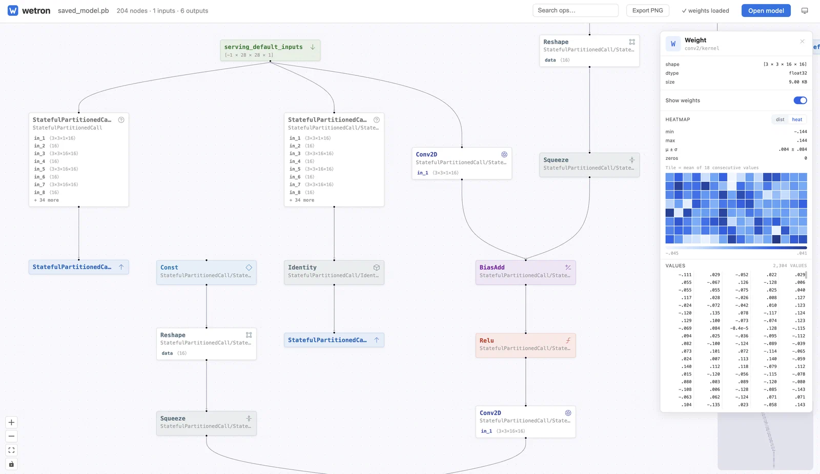
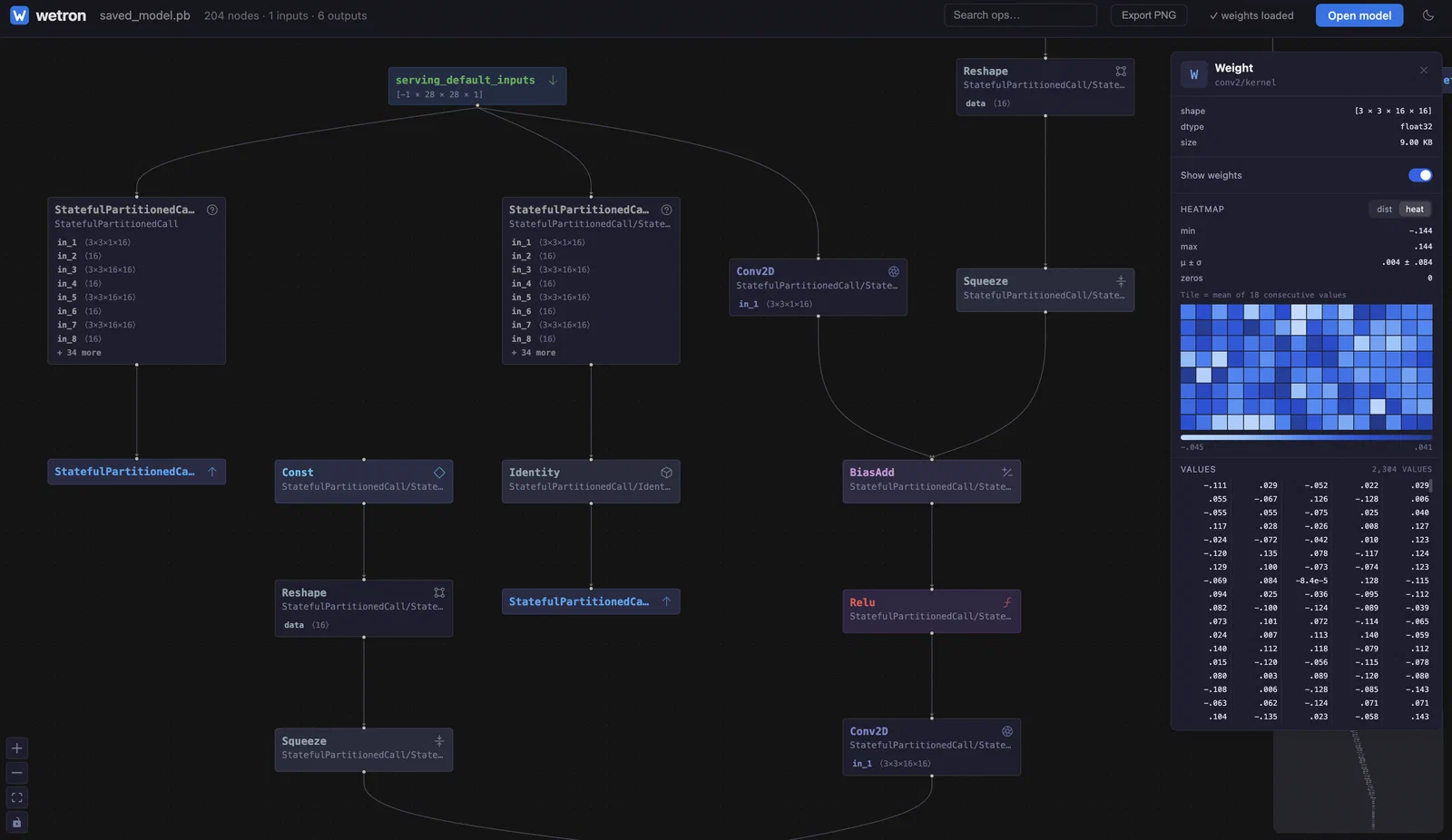
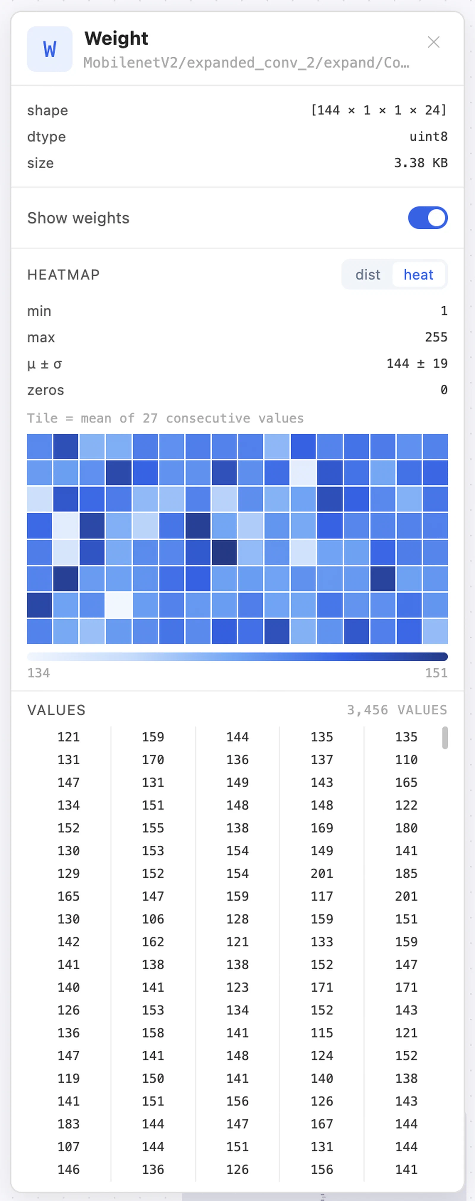
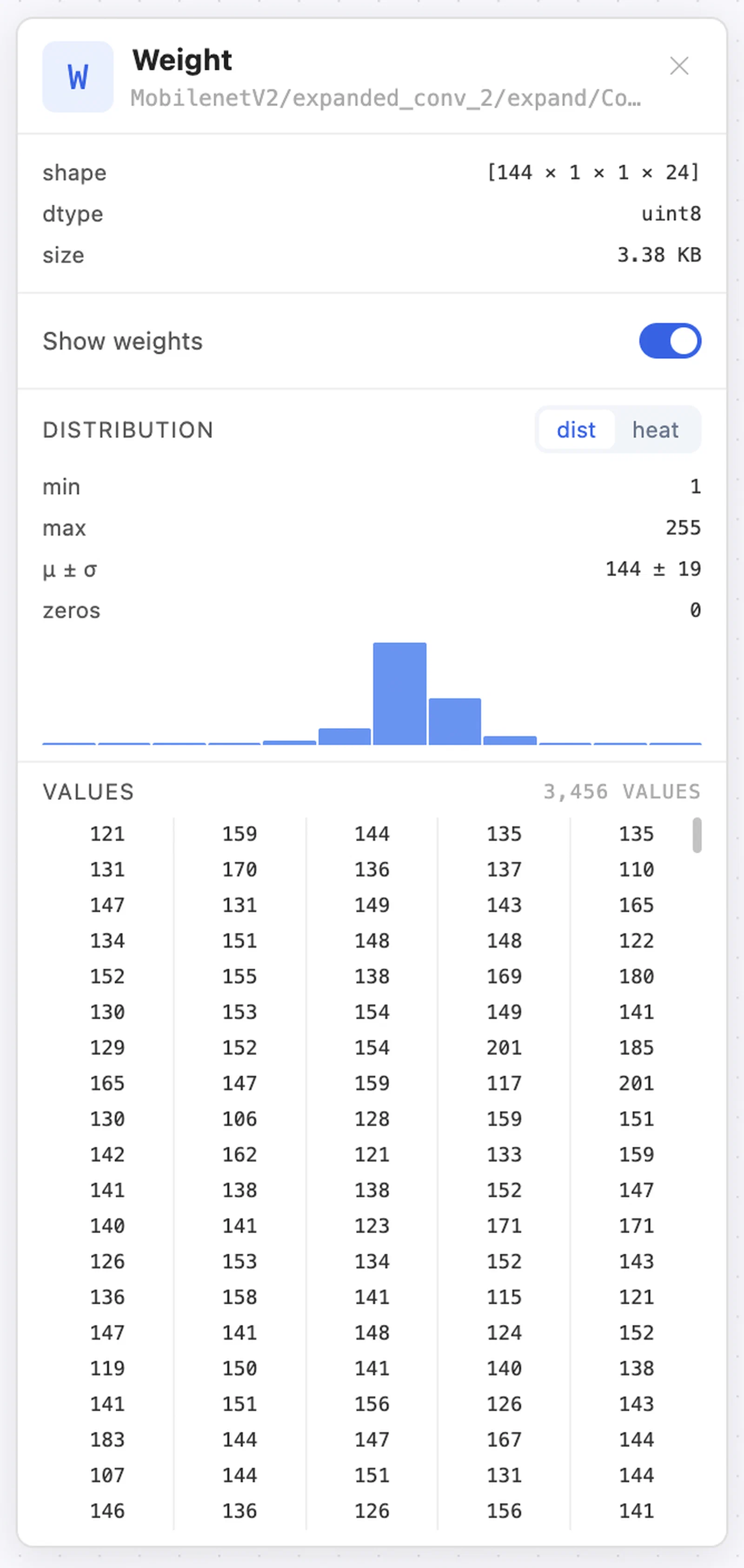
When target resolves to an initializer tensor (a name present in graph.initializers) and graph is supplied, the panel switches to the weight panel. It auto-enables decoding for models where fileSizeBytes <= 20MB and graph.weights is present, and offers an explicit “Show weights” toggle for larger files. The toggle is disabled when graph.hasExternalWeights && !graph.weights - the prompt to load checkpoint files is shown in that state.
The panel uses decodeWeight and computeStats from @wetron/core internally; the histogram and heatmap visualisations come from the same WeightStats.histogram (12 bins) and WeightStats.heatmap (16 × 8 grid) documented in
Weights.
type PanelTarget =
  | GraphNode
  | { graphValue: GraphValue; direction: "input" | "output" }
  | {
      edge: {
        tensorName: string;
        from: { opType: string; name: string };
        to: Array<{ opType: string; name: string }>;
      };
    }
  | { tensor: { name: string; shape: readonly number[] | null; dtype: string | null } };
Use isGraphNode(target) from @wetron/react to narrow to GraphNode.
Pass a ref to ModelGraphView to get imperative control:
const ref = useRef<ModelGraphViewHandle>(null);

type ModelGraphViewHandle = {
  fitAll: () => Promise<void>;
  getViewport: () => { x: number; y: number; zoom: number };
  setViewport: (vp: { x: number; y: number; zoom: number }) => void;
  getNodesBounds: () => { x: number; y: number; width: number; height: number };
  getViewportElement: () => HTMLElement | null;
};react ≥ 18react-dom ≥ 18@xyflow/react ≥ 12@phosphor-icons/react ≥ 2@base-ui/react ≥ 1